2026 Colour Trends: Exploring the Pinterest Palette Through Pattern & Print
Each year, Pinterest’s colour trends offer a fascinating snapshot of where design, mood, and culture are heading. For 2026, the palette feels thoughtful yet playful — balancing soft, grounding tones with bold, expressive colour moments.
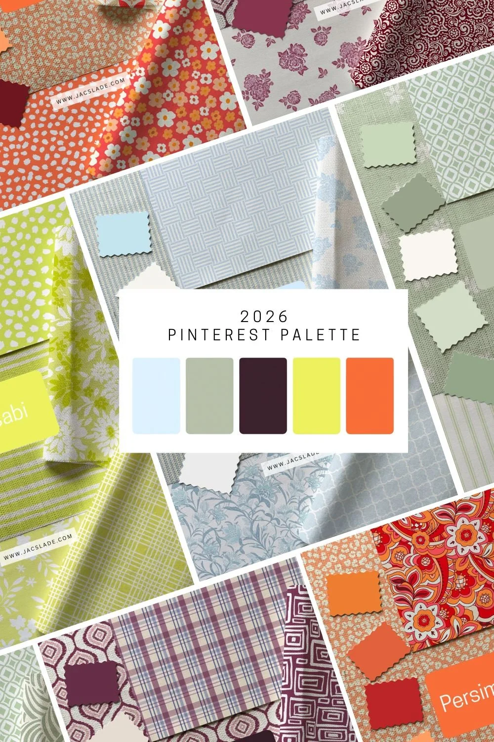
2026 Pinterest Color Palette
In this post, I’m sharing my take on the 2026 Pinterest Colour Palette, showcasing how these trending shades translate into surface pattern design. You’ll see one overall moodboard featuring all five colours together, along with individual moodboards for each shade, styled through my wallpaper and fabric designs.
Whether you’re an interior designer, maker, or simply love keeping an eye on upcoming colour trends, this is a gentle, visual look at how these hues can work across home décor, textiles, and creative projects
Colour Trend Source:
The 2026 colour palette information referenced in this post is based on Pinterest’s official colour trend forecasting. View the original source and full colour details here on the Pinterest website.a
2026 Pinterest Colour Palette — Colour Stories
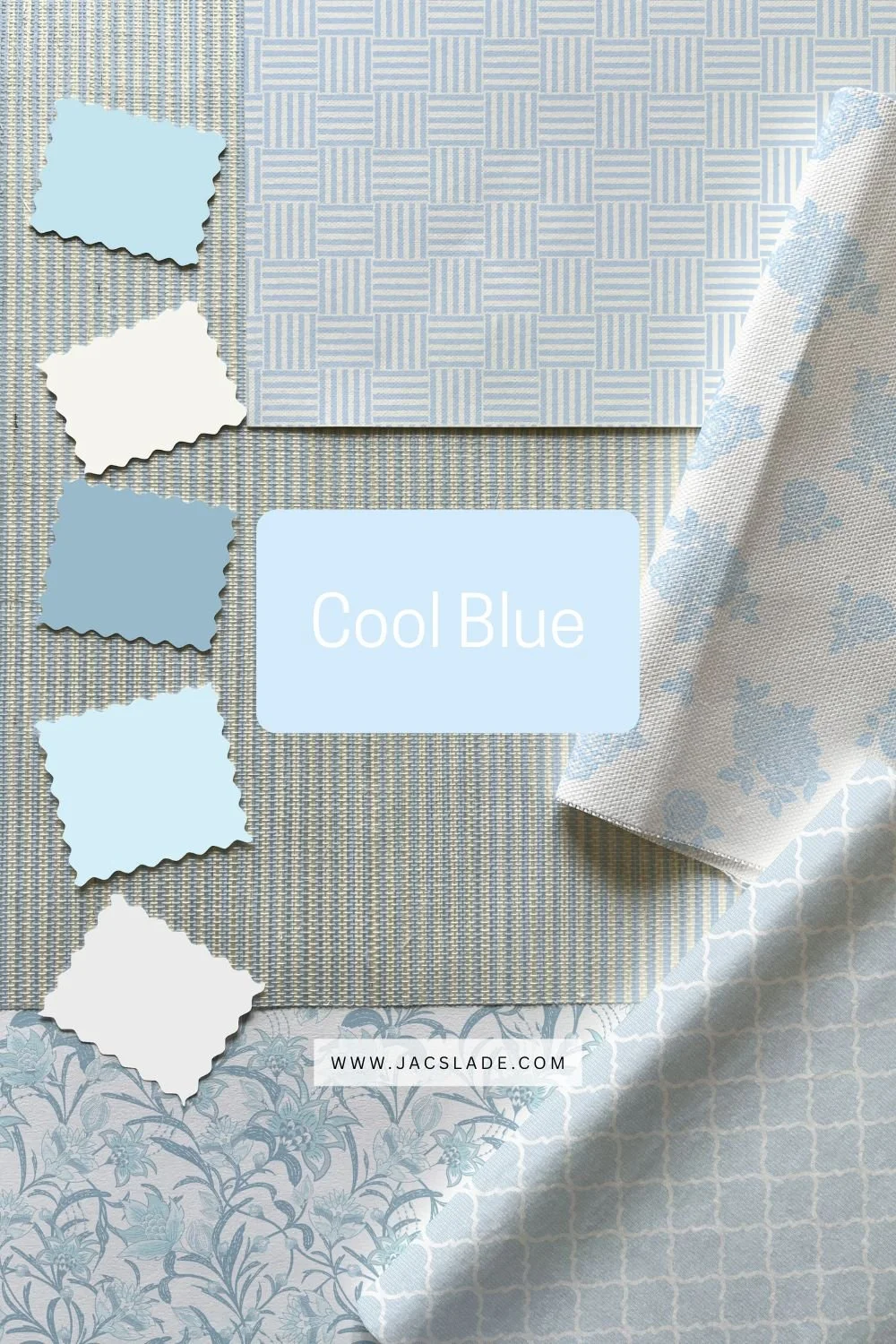
Cool Blue
Cool Blue is a fresh, airy shade that feels crisp without being cold. Light and calming, it brings a sense of openness and quiet confidence to interiors. In pattern design, this hue works beautifully for relaxed spaces — perfect for bedrooms, bathrooms, and soft Scandinavian-inspired homes.
Colour values
Hex: #D7EFFF
RGB: 215, 239, 255
CMYK: 16, 6, 0, 0

Jade
Jade sits gently between mint and moss, offering a grounded green with a refined edge. It feels serene yet elevated — a natural choice for timeless interiors and nature-inspired designs. This shade pairs effortlessly with neutrals, vintage florals, and textured patterns.
Colour values
Hex: #AEB8A0
RGB: 174, 184, 160
CMYK: 5, 0, 13, 28
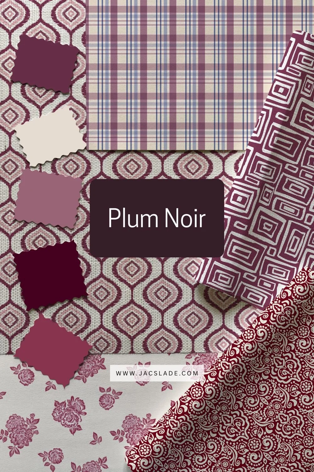
Plum Noir
Plum Noir is rich, moody, and indulgent. A deep blend of burgundy and brown undertones, it adds drama without overpowering a space. In wallpaper and fabric, this colour shines as a statement — perfect for cozy bedrooms, dining rooms, or layered heritage interiors.
Colour values
Hex: #351E28
RGB: 53, 30, 40
CMYK: 0, 43, 25, 79
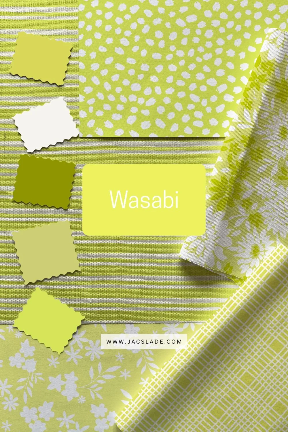
Wasabi
Wasabi brings an energetic spark to the palette. This lively chartreuse feels bold yet playful, adding instant lift to patterns and colour stories. Used thoughtfully, it’s a brilliant accent for modern interiors, creative spaces, and designs that lean joyful and expressive.
Colour values
Hex: #E9F056
RGB: 233, 240, 86
CMYK: 3, 0, 64, 6
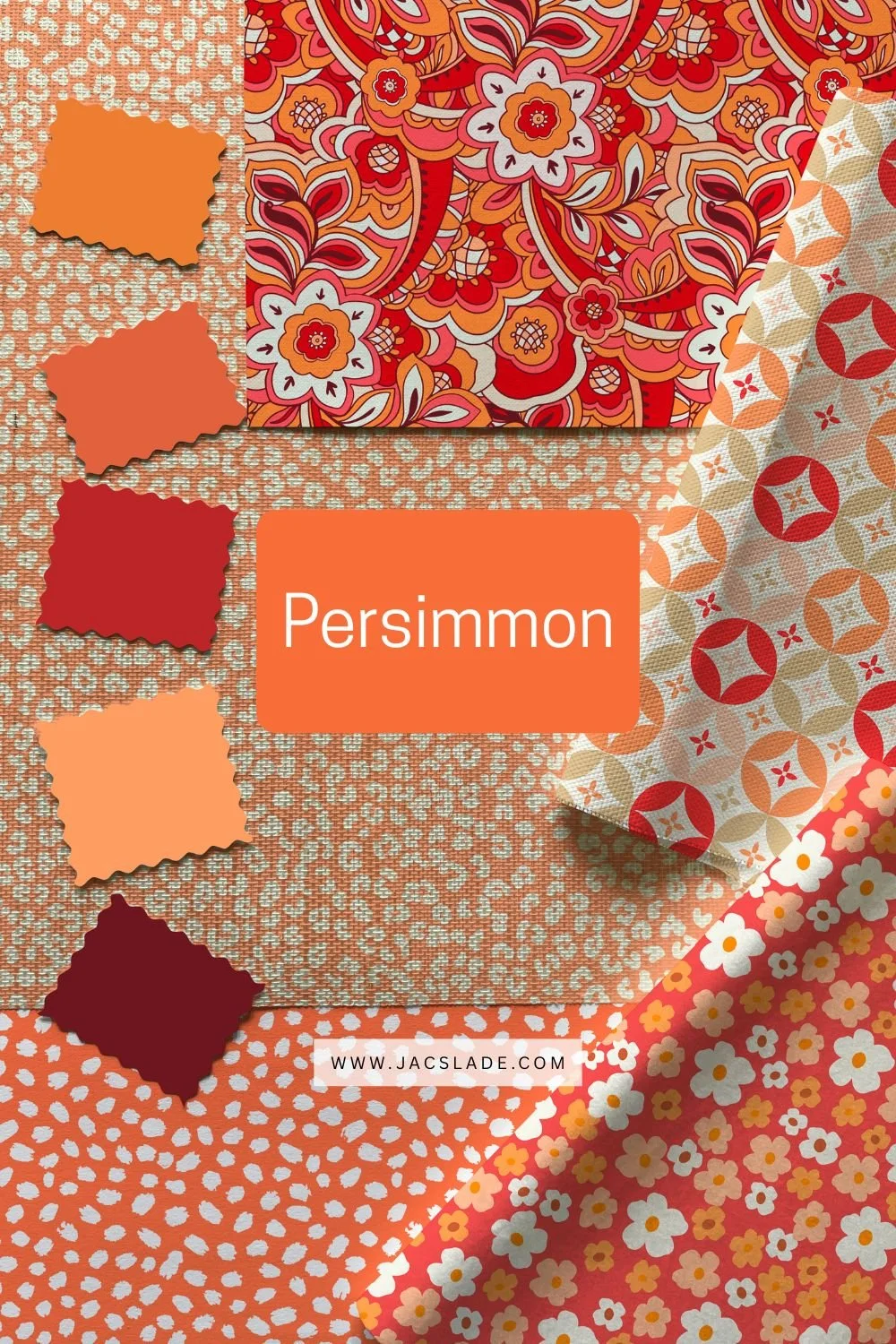
Persimmon
Persimmon is warm, vibrant, and full of personality. Sitting between orange and red, it radiates optimism and creative energy. This shade works beautifully in retro-inspired patterns, bohemian designs, and anywhere you want colour to feel welcoming and alive.
Colour values
Hex: #FF5C34
RGB: 255, 92, 52
CMYK: 0, 64, 80, 0
For more colour, design and interior inspiration
Colour Trend Source:
The 2026 colour palette information referenced in this post is based on Pinterest’s official colour trend forecasting. View the original source and full colour details here on the Pinterest website.