From Greek Island Blue to Boho Earth Tones — How the Mediterranean Summer Collection Evolved
The earth tone version of this collection was not the original plan — it grew out of the blue and white. I had finished the coastal stamp print and all its coordinates and I was looking at them laid out together, and I kept thinking about what happens to those same coastal icons in a different light. Not midday on a Greek island. Late afternoon in Portugal, or a Moroccan fishing village, or a sun-baked Spanish courtyard. The same world, just warmer.
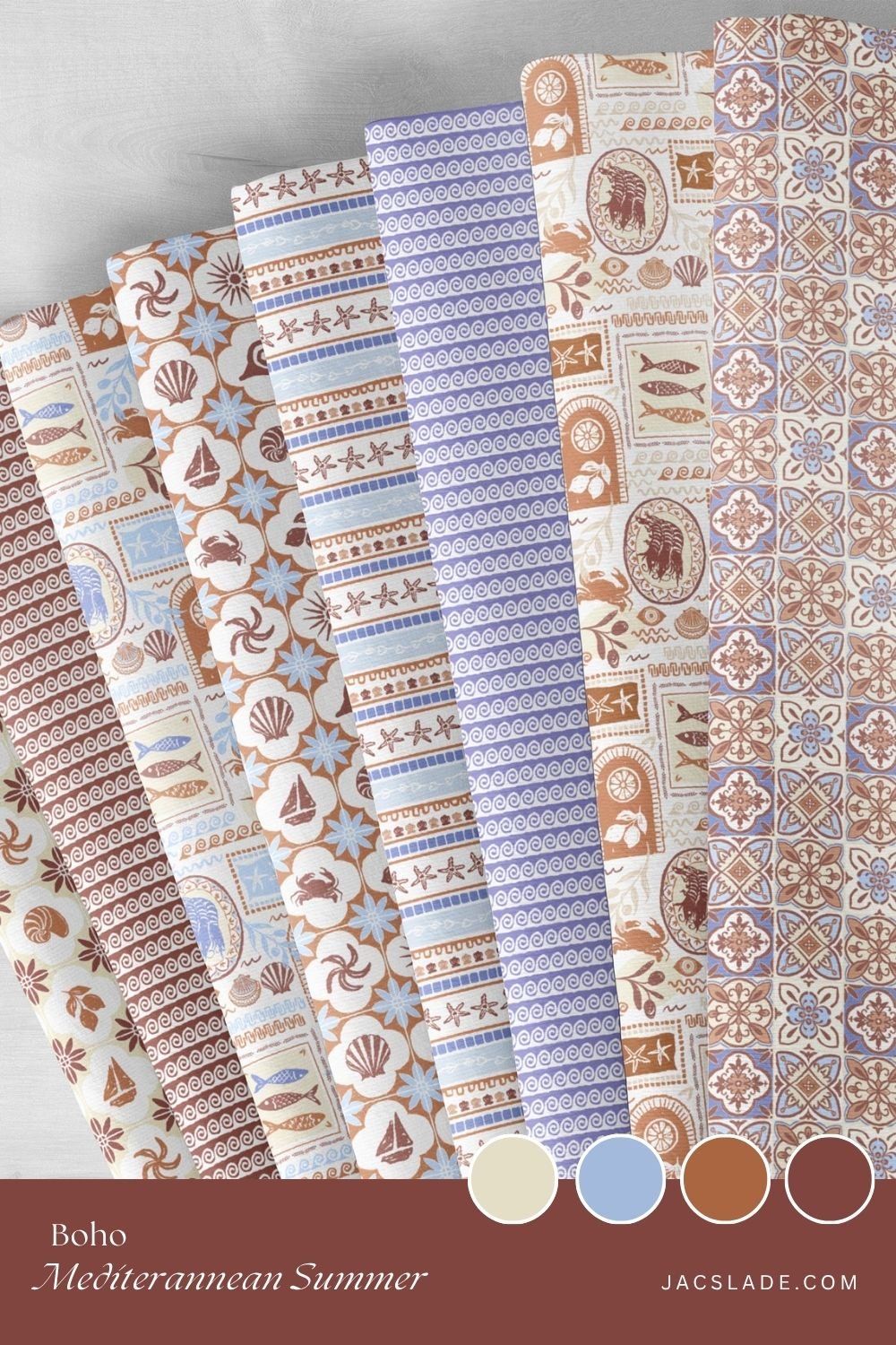
So I started pulling the same patterns through a palette of terracotta, rust, sienna, warm sand and dusty periwinkle — and something really different happened. The hero stamp print with its crabs, prawns, sardines, lemons and shells suddenly felt more rustic, more handcrafted. Less postcard, more old painted ceramic from a market stall. I loved it.
The Same Story, Warmer Light
Everything that is in the blue collection exists in the boho earth tone version too — the hero stamp print, the Portuguese-style tile coordinate, the Greek meander wave stripe, the watercolour cabana stripe, the whimsical coastal stripe with its starfish and shells, and the rustic tile check. But running those same patterns through warm earthy tones changes their character completely.
The Portuguese tile coordinate, which feels graphic and crisp in cobalt and white, becomes something much more aged and weathered in terracotta and cream. You can almost imagine it on the floor of an old farmhouse kitchen that has been there for decades. The rustic tile check with its lemons and shells and starfish leans into that quality even further — in rust and sienna it looks like something excavated from a beautiful ruin.
Why Earth Tones Work So Well for This Collection
The thing about the Mediterranean is that it is not all whitewashed walls and bright blue. There is so much warm ochre plasterwork, terracotta roofing, rust-coloured fishing boats, honey-coloured stone. The earth tone collection is trying to capture that side of the same landscape — the part that gets even more beautiful as the light gets lower.
I also think earth tones have a particular quality in interiors that cool blues can sometimes struggle to match: they are deeply welcoming. A terracotta and cream tile-patterned wall feels like it has been there forever, like the room is settled and comfortable. That boho coastal aesthetic — where everything looks collected and layered and slightly sun-aged — is very naturally served by this palette.
The Coordinates in Earth Tones
Each coordinate does something a little different in the warm palette:
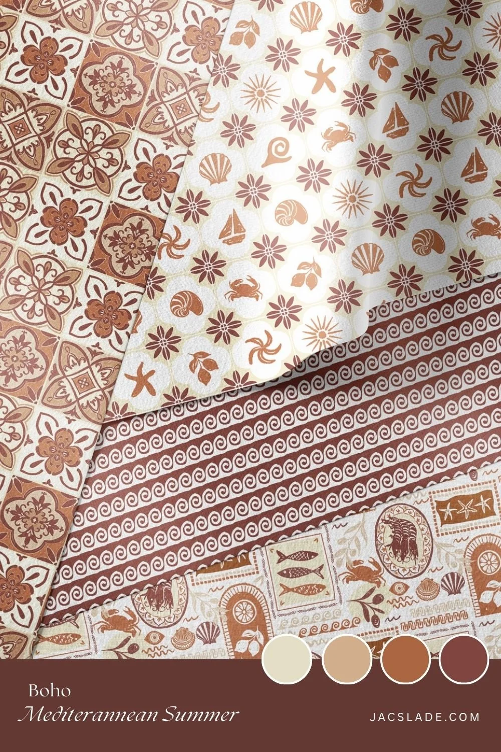
The Portuguese tile print in terracotta and cream — aged, geometric, deeply satisfying. Perfect as a wallpaper or on cushions and table linen.
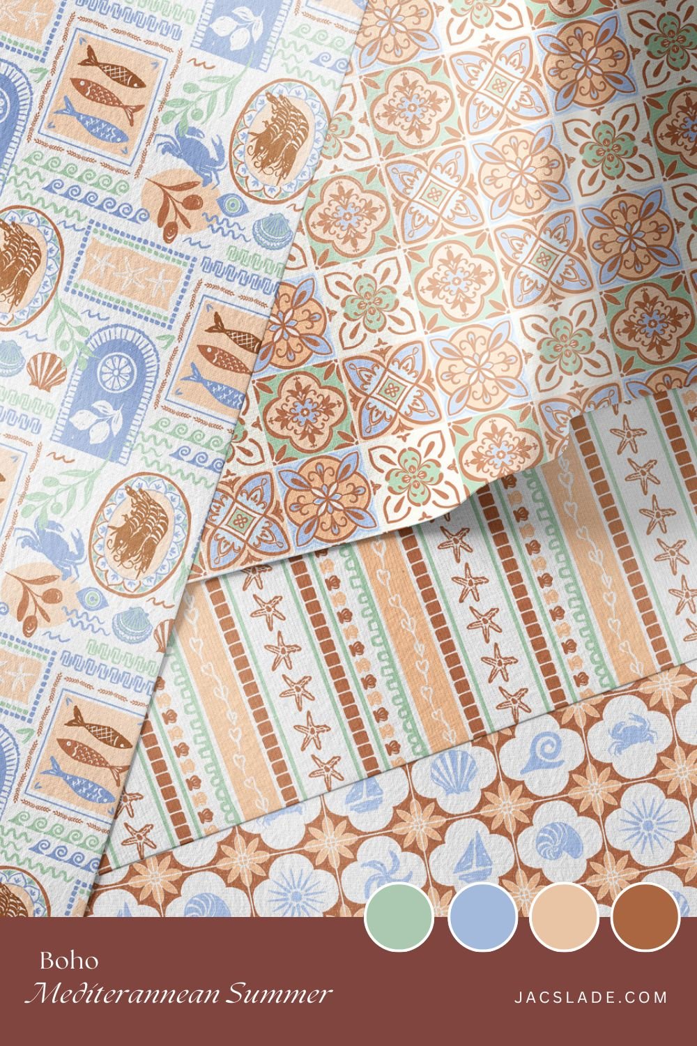
The Greek meander stripe in rust and sand — it reads as ancient in this palette, like a frieze from an archaeological site rather than a beach stripe.
The watercolour cabana stripe in warm peach and dusty blue — softer and more faded than its bright blue counterpart. Beautiful on curtains and bedding.
The whimsical coastal stripe with shells and starfish in sienna and cream — the illustrative quality comes forward more in this palette.
The rustic tile check in rust and warm ochre — this is the one that truly sings in earth tones. The lemons, shells and crabs feel like they belong to a terracotta tilework tradition that has been around for centuries.
Who This Version Is For
If the blue collection says Greek island holiday, this one says the kind of boho coastal home you have been quietly pinning for years — rattan furniture, aged brass, linen throws, terracotta pots, the smell of dried herbs. It is for people who love coastal living but find straight blue and white a little too crisp, a little too expected.
It also works beautifully for spaces where warmth really matters — dining rooms, living rooms, any room where you want people to feel immediately at ease. The earth tones do a lot of that work without you having to think too hard about it.
The full earth tone collection is available through Spoonflower on wallpaper, fabric and home décor. The grasscloth wallpaper finish is particularly beautiful with these warm tones if you want an extra layer of texture and depth.
The same coastline, different light. I hope you love it. — Jacqui
For more colour, design and interior inspiration